Portrait photography Lighting Tips - Portrait Photography lighting set-up
Here is an example and demonstration of my most often used portrait photography lighting set-up. I call it my “business portrait photography lighting set-up" or my three light portrait lighting set-up. It’s nothing fancy, just good solid portrait lighting, and it’s very acceptable to the business community. There are lots of corporations and companies that want business photography portraits for brochures and advertising purposes and this is the perfect portrait photography lighting set-up for the commercial photographer that needs to get something nice and get it fast.
Portrait photography lighting is not rocket science. Once you get a system that works for you, you'll only need to modify it a little for each individual, so as you experiment, make sure you take good notes so that you can reproduce your portrait lighting set up at a moment's notice.
|
|
|
|
|

Client with portrait photography 3 light set-up
|
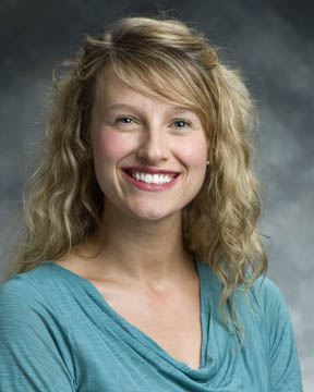
Sandy with portrait photography 3 light set-up
|
|
Portrait photography main light
The main portrait photography light’s purpose is to give shape and to convey information. Much has been written about the main light, so I won’t get into that here. Let’s get on to the other, lesser know lights use in the three light set-up.
* note how bright the background is. In portrait photography, if the background is near the subject, it's difficult to light separately. The same light that hits the subject, also hits the background. That's why I prefer to have ten to fifteen feet between the subject and the background. That kind of distance allows the background to "fall off".
Another good reason for getting as much distance as possible (within reason) is so that you can control the focus of the background. In this example, I think that the background texture is a little distracting I would have preferred it to be more out of focus. Notice the texture in the "real samples provided on this page.
|
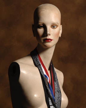
Portrait photography main light only
|
|
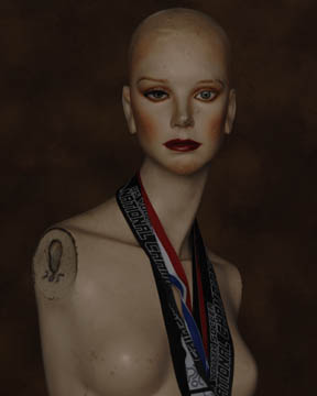
Portrait photography fill light only
|
Portrait Photography fill light
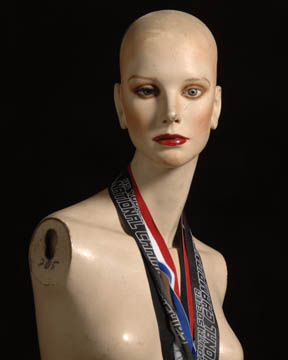
If you’re one of those people that read ahead, you’ve probably already detected that I have listed four lights, but the title of this article is “three light set-up”. Ok. I’m busted. Since I often use this set up on location and because I’m just lazy, I often just forget the fill light and in its place, use a fill card of some kind. In the studio, I use a sheet of 4x8 foamcore, leaning up against a light stand.
On location, I use the largest flex-fill I have, and suspend it from a light stand, moving it closer and farther away from the subject until I get the look (ratio) that I want. Since the fill light (flex-fill or white board) is on one side of the subject and not directly in front of the subject, it only illuminates the shadow side of the subject. For those of you that MUST know what the light ratio is, you’re out of luck. When you’re using a “bounce” as a fill, you just can’t turn off the main light without turning off the fill light too. :+) Photography is an art form. Don’t be glued to a formula. This is all meant to be a starting point so that you can understand the ideas and then be free to break all the rules to create something that is effective and uniquely yours.
|
|
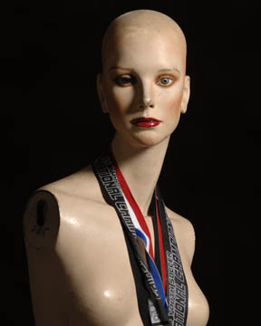
Portrait photography - main and flex fill three feet from subject
|
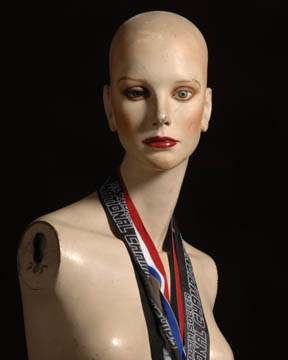
Portrait photography - Main and flex fill two feet from subject
|
Portrait photography - Main and flex fill one foot from subject
|
|
|
Portrait photography background light only
|
Portrait photography background light
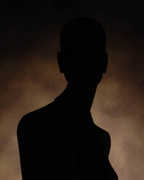
The purpose of the background light in portrait photography is to relieve the shadows so that the idea you’re attempting to portray in your photo is achieved. You might say that there is no “idea” in a simple portrait. Ok, I’ll buy that. But you are trying to represent a “person” in your photo, right? The fill light lightens the shadows. The darker the shadows are, the more dramatic the shot. Do you want dramatic? A better question might be, does your client want / expect dramatic? If not, you might want to move that fill card in a little closer…
Besides just separating the subject from the background, I usually like to graduate the background a little to add a little more interest to the shot. To get the graduation, in my portrait photography, I usually use a spotlight or grid to create the pool of light on the background. Again, don’t forget that this light is a tool. It has a job to do and that job is to fulfill your vision of what the photo should look like.
|
|
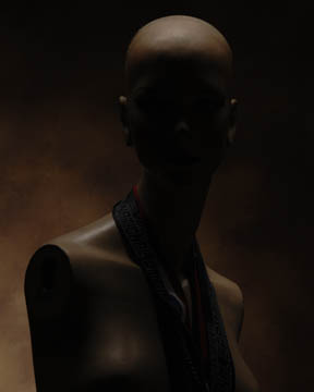 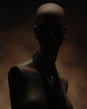 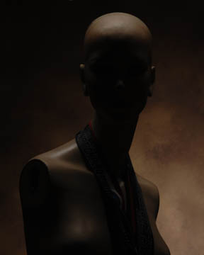
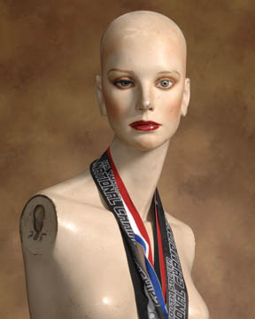
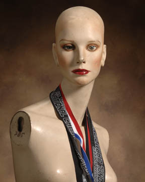
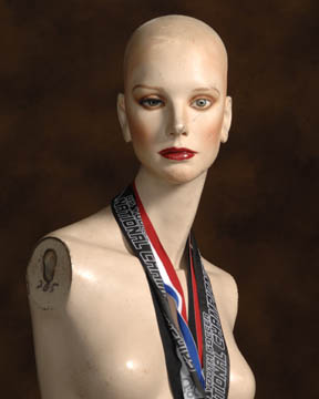
See how in this photography portrait the background light is placed in different areas of the photo in these three shots? Use the background light as a tool. |
|
The pool of light can be either centered on the background or placed off to one side or another, depending on where it looks best. Sometimes, I like to place the brighter portion of the light pool behind the shadow side of the subject. Most of the time though, I like to have the majority of the light pool in front of the subject. Besides using the intensity of the light as a tool, I also like to use the vertical placement as a creative element too. Normally, in my portrait photography, I place the pool of light so that the graduation happens mostly at “face level”, letting the area above the head go the darkest, but there have been times when I change things up a little. Even with business portrait photography, it’s good to experiment now and again.
* note how soft the background is here. This the same background as the very first portait on this page, but see what a little more distance from the camera can do?
|
 |
|

|
Depending on the subject and the background in your portrait photo, he intensity of the background may need to be either brighter or darker than the last time you used it. I just can’t tell you how bright the light should be or what kind of main light to background light ratio you should have. It should all depend on the individual situation in each individual portrait. If the background is dark and the subject is wearing a dark suit, maybe the background light needs to be pumped up a bit. Maybe you want the subject to blend into the background for some reason. Then in that case, maybe the background light isn’t needed at all. It will all depend on your vision.
In this shot, the tone of the shirt and the tone of the background are close. I probably should have darkened the background a little to make the subject stand out more.
|
|
Earlier I mentioned that having the background too close to the subject could cause a background in your portrait to become too light. Here we have two samples. On the first sample, I shot the subject with all three lights as shown in the illustration.
|
On this of portrait photography, I placed a flag between main light and the background, without taking any light off of the subject.
|
|
 |
 |
|
This is the same two portrait photography lighting setups with only the main lighit firing, only the second shot has the flex-fill in place. Note how dark the background is in the second portrait. It's hard to get dark, if you begin light.
|
|
 |
Portrait photography hair light
The purpose of the hair light in portrait photography is to help separate the subject from the background and to add a little bit of dimension to the photo. A light coming from above (and slightly behind) the subject will add a little roundness to the shoulders of the subject and lighten the upper edge of the subject too. This light is especially helpful in separating dark hair from a dark background. If the subject is dark and the photographer wishes to keep the background dark, this edge light will tend to brighten just the hair and shoulders, separating, but not overly brightening the subject of your portrait.
|
|
Portrait Photography Lighting Tip #1
One mistake newbee portrait photographers make is putting the hair light directly above the subject. If the hair light is too far forward, the light illuminates the nose of the subject. This is usually not desirable, unless the portrait photographer wants their subject to look like Rudolf, that is…
|

Portrait Photography Lighting Tip #2
It is called a hair light for a reason. If the subject of your photography portrait is follicly impaired (bald), you might want to turn this light completely off. Unless that is, you’re really good at Photoshop!
|
|
|
Portrait Photography Lighting Tip #3
If you’re setting up our portrait lighting to shoot multiple portraits and you want to have the shoot to run smoothly, It’s a good idea to have the hair light on its own power pack so that you can adjust it or turn it off without affecting the power to all the other flash heads. It's also easier that way so that you can just flip a switch and no one even know you've turned off the light. That keeps the portrait photography subject's balding issue from even coming up in conversation.
Here are a few more comments and examples
|
 |
 |
 |
 |
|
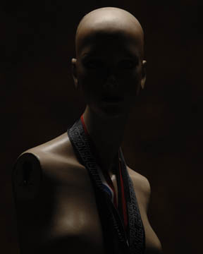
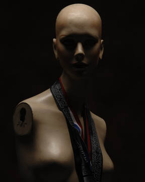
These two images were shot under the same lighting . Notice how the body is lit in one of the frames and not in the other. In portrait photography, this is a tool to be used. In which photo does the subject look to be thinner? Just something to kick around...
|
|
|
|
|
|
|
|
|
Michael Ray's photography and advertising links
|
|
|
|
|
|
|
|
|
|
|
|
|
|
|
|
|
|
|
|
|
|
|
|
|