|
|
Environmental Portrait Photography
In the profession of location environmental portrait photography, there are some universal challenges. One of the many challenges with photographing people on location is getting “good lighting” on the subject while at the same time, capturing the true essence of the location.
|
|
|
The main challenge of environmental portrait photography
As a portrait photographer, you’re usually shooting on location for a reason. The location helps tell an important aspect of the story as it relates to your subject. It’s important that you, as the photographer, intelligently incorporate and represent the location in your photo. The problem is that on most occasions, the available light is not at all flattering to your subject. After years of experimentation, I’ve come up with several solutions to this photographic dilemma, and just recently have come up with, what I think, is the best solution. I can now get the best of worlds, “natural” lighting for the environment, and “quality” lighting for the portrait subject. Here’s how I do it…
|
|
The background tells the story of your environmental portrait
If your assignment is to photograph a baker on location, a big part of your challenge is to select an environment that best tells the story of just who this person actually is. You might want to include in the background of your photo a mixer, an oven, or some other significant, job related element. Better yet, you need to do more than just include an appropriate element in the background somewhere, you need to create a meaningful composition out of all the elements in the background. You’ll need to decide what stays in the background and what is cropped out. Through this editing process, you will make the decisions necessary to create a composition that is both meaningful and artistically pleasing. The background should help tell the story AND look good too. Photography is about entertaining and informing. The background need to tell the viewer something and also needs to appear pleasing to the eye. If the photographer fails to inform at the expense of great composition, the photo fails to fulfill its purpose. And if the photo informs and isn’t compelling to view, then no one will take the time to look at it.
|
 |
 |
|
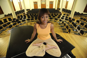
Backgrounds play a major part in telling the story of environmental portraits. Can you tell what these college students are majoring in? It would be hard to tell without the background.
|
|
Compose / then light (in all types of photography).
My second photography job out of art School was as a catalog photographer in Chicago. This photo studio employed pretty amazing to a young photographer like me. It had over a hundred and fifty people and twenty or so of these people were photographers. In addition to the people that actually took the pictures, there were about fifteen photo assistants, a bunch of stylists, and quite a few people that did nothing but cart product back and forth to the shipping department. It was quite an operation and a great place to learn the craft of photography. As a matter of fact, I probably learned more at the lunch table there in just a few months, than I had learned in two years of art school and almost three years at my first job as a photographer for a graphic design firm. There were some really good photographers there at the catalog house. I wasn’t one of them, :+) but that place was a great environment to learn photography.
Probably one of the most useful concepts I learned from my time there at the catalog photography studio was “compose, then light”. I can’t tell you how many times I’ve forgotten that lesson over the years, and lived to regret it… The result of forgetting that lesson was either wasted time, or poor quality photographs. Many times, I’ve had an idea of how I wanted to light something and went ahead and started the process of lighting before composing the shot, only to find out that once the composition was complete, the lighting I had chosen was all wrong. At that point, I needed to make the decision to either live with the lighting I’d started with, or to tear the lighting down and start all over.
When you’re shooting a portrait, as you arrange your subject in relation to his environment, you will need to make decisions that allow you to create the best possible composition. Some of those decisions will affect the choice of lighting tactics you will want to employ. First compose your subject in the environment and then worry about what you’ll do with the lighting. I’m not saying to forget the lighting. I’m saying that the composition is the priority, and besides, I’m about to tell you how you can get good composition AND good lighting, not matter what the available light looks like.
The possible solutions to environmental portrait photography lighting challenges.
Okay… Lets say that you’ve taken the time to arrange your subject in his environment and you’re really happy with the composition. The background supports the story behind the photo, there aren’t any poles growing out of the subject’s head, the cropping feels balanced and over all, you think that you might just get a portfolio piece out of this one… There’s only one problem. The lighting on the subject really sucks. The light is coming from strait above and the subject’s eyes making him look like some kind of Neanderthal and his nose so bright that he might be somehow related to Rudolf the reindeer. There goes the portfolio piece… Not so fast. In a case like this, you have several options, one of which will always guarantee you a beautifully lit shot.
The environmental portrait lighting options below are all valid and I’ve used all the solutions at sometime over the years. I’m not proud of that fact, but at one time or another, I’ve used them all. I hope that I can save you some time here in your learning curve and explain what NOT to do.
|
|
|
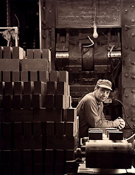 |
Environmental Portrait Lighting Option #1 - Live with crappy lighting.
Nobody wants to do that...? I see photographers do it all the time… In fact, many photographers don’t even know the difference between good and crappy lighting. If you don’t know the difference, you can stop reading now. :+) If you can recognize the difference, then if you possibly can, you will want to improve the lighting by using one of the other portrait lighting options listed below.
Environmental Portrait Photography Lighting Option #2 - Tweak the composition a little to get better lighting.
Another possible option would be to tweak the composition and make a compromise between composition and lighting. You might notice that if you move the camera and subject over a little, you’ll get a similar shot, but it won’t be exactly what you want. Why do that? Why not take the time to do it right? The answer is “TIME”. Solutions usually take time and sometimes photographers just don’t have the time to light something the way they’d like to. Time is a valid excuse for compromise when the budget demands it, but laziness isn’t. If your excuse for compromise is laziness, then you’ll probably never get any better as a photographer. And that’s okay too. There are too damn many photographers out there anyway… If you’re not the type of photographer that is always attempting to improve himself, then you’ll eventually become a failure at photography and that will means less competition for the rest of us… :+)
This reminds me of another lesson I learned much earlier in my career. The lesson I’m referring to is “There is ONE best place to put the camera”. It seems like that can’t possibly be true, but I’ve learned from experience, usually it is true… One inch either up, down, left, right, forward, or backward, will make a difference. Sometimes that difference is subtle and sometimes the difference it’s amazingly huge. In any case, there will be a difference and it’s your job to decide which EXACT spot is the best place to perch your camera. Just for fun try this… Look up from your computer and find an area on the far wall that you think would make an interesting photograph. In your mind, place a crop on that composition… Now move your head an inch to one side. You’ll notice that the composition changed a bit. That lamp intersects the wall a little differently, doesn’t it? The cup of coffee is now tangent with the sugar, and before it wasn’t. Just a little change does make a difference. Use this difference to refine your photographic eye in order to improve your photography. You know… I should charge you for this paragraph. For me, this concept was one of those rare epiphany moments that make a huge difference in the long run. I hope it is for you…
So, if time is more important than optimal quality, then it might be a faster solution to tweak the composition to avoid the nasty lighting. It won’t give you the BEST shot possible, but in the world of commercial photography, sometimes faster, trumps better.
|

Sometimes, you can just move the subject a little to get them out of the "bad" light and into either darkness, or "not-so-bad" light. In this case though, I used option #6 and blended my light with the background light. I think that the light coming in from the window to the right of the frame, helps the lighting look natural.
|
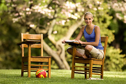
There will be times when you just can't turn off the light above the subject or block off enough area to make things better. In cases like those, you can only live with compromises.... I’m not super happy with the lighting here, but over all, the shot still works.
|
|
Environmental Portrait Photography Lighting Option #3 - Light the whole damn place.
There was a time in my career that lighting the subject and entire environment, would have been the obvious solution to the problem. That was back before the days of high quality, high ISO, digital photography. Back in the old days (God… I sound like an old fart) most commercial photographers didn’t like to use a film ASA above 100 and the fastest Hasselblad lens was an F4. Combine those two factors and there usually wasn’t enough light to pull off most people shots without some type of movement, either people movement or camera movement. The solution back then was to light everything with strobe and let that take care of the motion problems and the color temperature problems too. There are three reasons why that solution isn’t a good solution any more.
A. When a photographer lights an environment, it’s hard to make that environment look natural, let alone the way it originally looked. The reason is, the photographer will try to keep his lights out of the picture while in reality, there will usually be several light sources, naturally in the picture. Who wants to see light stands and umbrellas in their picture? To look natural, if there is a lamp in the picture, that lamp should probably be lit. Strobe (or flash) will usually over power that lamp and make it look as though it is unlit, and therefore subconsciously unnatural. And if that lamp in your crop is lit, it will affect (light) other elements in the photo too. You will see this effect as brightness and as a color difference. It’s hard to duplicate this effect when you use strobe to overpower the ambient light.
B. In order to light large areas, you need to have a bunch of strobe equipment and that equipment tends to be very expensive for the photographer to purchase and maintain. The bigger the environment the more equipment you’ll need and the more money you’ll need to pay for the equipment. I’d rather buy other toys with my money. Buying a few new strobes is fun, but I’d rather be spending my money of guns or motorcycles…
C. Another reason to avoid lighting the entire set is because it takes a bunch of time. And you know what they say about time… Time is money and money is what some clients use as a factor when considering who to hire for a particular job. If you’re more expensive than the next guy because you take longer to photograph the same subject, then there’s a big chance that you’re going to loose SOME jobs on account of your higher costs.
|

Sometimes lighting the entire background is the only way to make a location dramatic...
|

See how the lights are on in the background. It's very difficult to light the entire background and still maintain a natural feeling. It's much easier to just light the subject and drag shutter for the background.
|
|
Environmental Portrait Photography Lighting Option #4 - Light the person and let the background do what it will.
One option many photographers use is to add just enough light to the subject to overpower the ambient light and drag the shutter to make the background look as natural as possible. “As natural as possible” is the key phrase here and is why this isn’t the best option possible. As you add the light necessary to overpower the available light, You will see the result is that the background naturally does “darker” then it normally would appear. While this is sometimes a really cool effect, it’s not what you want if your goal is to make the scene look “natural”. In reality, the background is just about the same brightness as the subject. Unless, that is, the background is pretty far away or is something like a window, which would naturally be interpreted as being brighter.
|
|
Environmental Portrait Photography Lighting Option #5 - Disconnect lights directly over the subject.
One technique I use to use all the time, is to simply disconnect or turn off the lights directly above the subject. This works really well if the lights are on a controllable switch, but if they aren’t, tends to be a bit time consuming and sometimes the client does not look kindly on my assistant while he was fishing around in their light fixtures. Sometimes I get lucky and I’m just be able to turn off the lights I need darkened. but more time than not, the lights I want turned off, are on the same switch as the background light, which I want to stay on. And then there are the times when the lights I want to darken aren’t even on a switch. Many lights in corporate buildings are always on as some kind of safety precaution and turning them off isn’t even on option.
If I can’t find the switch to the lights we want to turn off, first I need to get a ladder somewhere, and that’s usually a real pain. And that’s if the lights are even reachable. Then we have to open up the fixtures and turn the bulbs while trying to avoid being burned… And then after the shoot, I’d have to take the time to reconnect the light. And then there were the times when I couldn’t even reach the lights. Sometimes the lights were fifty feet in the air. All this time messing around translated to delay and therefore money. Technically, the solution was a good one if I could make it happen, but there had to be a better way.
These next few images are "before & after" samples of using
environmental portrait lighting option #6
|
|
Environmental Portrait Photography Lighting Option #6 - The best solution - flag and blend
After considering all the pros and cons of all the possible solutions above, I came up with what I think is an ideal solution. Of course, it’s not a perfect solution. There are a few down-sides. And even though, I act as if I invented this solution, I’m sure that there are many people out there that have been doing this for years now, and would probably laugh at this article. From what I can tell, the film industry uses this technique all the time, but I’ve never heard of any still photographers talking about it. I’m assuming then if it’s new to me, then you probably haven’t figured it out yet either. The technique is to block off the overhead light from the subject using large flags and to add your own “quality” light to give you a well lit portrait AND a natural looking background.
I found two sets of hardware to help me with blocking off the light that comes from above the subject. I either use “road rags” or I use 4x4 “floppy” flags. Both of these products can be purchased from places like Calumet of B&H.
|
|
|
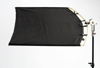
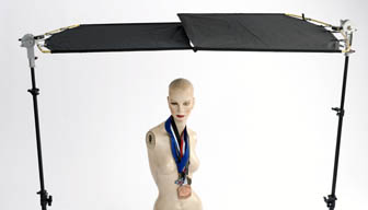
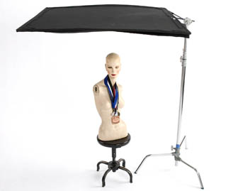
The shot on the left is a photo of one roadrag. (24” x 35”) They come in a couple different sizes, but this one seems to work well for me. I usually use two them together as in the second photo. These things disassemble and fit into a case that is easily transportable. Also, please notice that I am using a lightweight stand to support the flag. With the other “floppy” flags shown down below, you must use much heavier stands. This adds to the pain-in-the-butt factor of transporting the things. The roadrags work well as long as I don’t need to shoot multiple people in one shot.
|
 |
 |
|
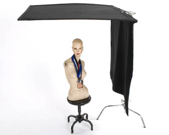
These flags are called floppies and measure 48” x 48”. There is another piece of material sewn to the end of the “flag” and then velcroed in multiple places to hold it together in case you don’t want to employ the “floppy feature. The floppy side of the flag is used to block out any side light that might be causing you problems. When you order the flag, you have the option of which end the floppy material is attached. I chose the support end so that I could use two floppies like I use the roadrags. Whenever possible, I prefer to take the floppies and use them. They cover block out more light They are quite heavy and require a heavy stand to support them.
|
The road rag solution is more portable because of its lightweight and “pack-ability”, but offers less coverage than the 4x4 floppy solution. The road rags are 24” x 35” each while the floppies are 48” x 48” square. The smaller size of the road rags mean that you need to keep them closer to the subject in order to achieve the same light blocking ability as the 48” flags. That’s a definite down-side, but the portability issue sometimes outweighs the size advantage of the larger flags. Transporting 48” square flags is a real problem sometimes. I’ve come up with a way to make transportation of these large flags a little easier, but sometimes the size and weight factor makes the larger flags too much of a pain in the butt. Besides the weight and size of the 48” flags, you’ll need a larger / sturdier light stand to support the weight of the larger flags. This adds even more size and weight to the location kit and in turn, slows the shoot down even more. If time is a factor and I know I won’t be shooting multiple people in one shot, I will sometimes opt for the smaller flag solution, but if I know that quality and control is a most important factor, then I’ll opt for the 48” floppies. As a matter of fact, I’ll take two floppies and use both in most circumstances.

I buy my equipment at Calumet Photo. Click the logo bar above to see their site.
|
 |
|
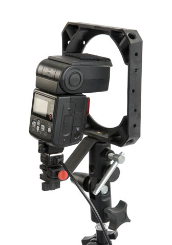
One of the shots above is of the bag the road rags come in. This also gives you an idea of how large, but light, the whole system is. The other shot is of a bracket that I picked up from Calumet. I normally shoot with Norman strobes, but I’ve put together a light weight lighting kit containing three hand-held strobes. This bracket allows me to mount a soft box to the speedring. One problem you’ll run into when attempting to have very little depth of field, is having “little” enough light. Large strobe packs just won’t turn low enough to get the right amount of light you need to blend with the background. These hand-held flashes have the ability of turning down to a very low setting which allows fot the perfect amount of light.
|
Using either of these flag systems is a great solution for getting the light off the subject, but that’s only half the solution. To make the subject look good, you now need to add light.
The color of the light you add should match the light color in your background. To do this, you need to know what color light is on the background and then filter your lights so that the two lights match. I use a color meter to figure out the color the background lights is and then I filter my lights to match the existing them. Sometimes there are multiple background lights of different colors. In this case, you’ll want to experiment to see which color you should match. One word of caution here…. From experience, I can tell you that you should use your computer screen and not your camera screen to make these decisions. The camera back just doesn’t cut-it when it comes to making critical decisions about color temperature and even contrast, for that matter.
If you don’t have a color meter, I wouldn’t worry all that much. With a little experience, you’ll be able to tell which filters to add to match which lights. Digital photography allows you to take test shots for free. Just take a shot and see how well the filter pack matches the background. To test your filter pack, I suggest that you white balance for the strobe and then see where the background falls. Shoot and then adjust. Sometimes, having a different color background is pretty cool and sometimes it’s not. Another thing to keep in mind is that you can use the color as a tool. Do you want it to look real? If so, match the colors. If not, play with them until you get something you think is interesting. Again, I would suggest that you use your computer to make these decisions. I’ve been burned and unpleasantly surprised at the results from shoots where I’ve trusted the camera back instead of the computer screen.
|
Matching the exposure as you blend your light to the background light, is a simple matter of adjusting the strobe power and / or adjusting the camera shutter speed to manipulate the ambient exposure. If you need a little more depth of field, crank up the strobe and turn up the shutter speed. Shoot and adjust
Just a note here… What’s made this technique really usable is the recent advancement in quality high ISO sensitivity of digital cameras. The latest generation of cameras have really improved the image quality at high ISOs. I feel confident now shooting as high a ISO 1600. With the earlier generations of digital cameras or with film cameras, I wouldn’t have dreamed of using an ISO of 1600. If I did, the grain would make the image commercially unusable, whereas now, the pictures from today’s cameras look great at even higher ISOs than that.
So, there you have it… This is a great technique for improving your environmental portraiture. Wedding shooters and commercial photographers both can use this technique to improve the look of their photography. I hope this helps you to enjoy this great profession (or hobby) of photography .
|
|
|
|
|
|
|
|
|
Michael Ray's photography and advertising links
|
|
|
|
|
|
|
|
|
|
|
|
|
|
|
|
|
|
|
|
|
|
|
|
|
|
|