|
Photographic Light sources and what distance should they be from the photography subject?
Photography Portrait Lighting 101- Learn photographic portrait lighting tips, tricks, and techniques. Understand why the distance of your main light matters to the lighting effect you are creating. Besides making the photography lighting effect appear harsher or softer, the distance of the light will some unintended consequences on some other aspects of your portrait photography.
Portrait Lighting Equipment Technique - Distance of the main light
Introduction to Photographic Lighting source distance issues for portrait photography– Pretty much ever novice photographer wants to get a hold of some lights so that they can explore the world of photographic lighting.
|
|

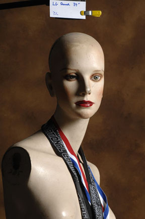
Full Frame Test shot - see details below
|
And one of the most popular and most available subjects are people, so portrait lighting is one of the first challenges of the newly armed photographer.
One of the first questions to come up in novice photographer’s mind, is how far away should these light be? The answer to that question is not all that simple but this article is dedicated to answering it. I’ve come up with six things that influence how far away the portrait photographer should place the lights from the portrait subject. There are probably more reasons, but for now, this will have to do.
Portrait Photography Work Area - I have a good friend that is a Senior Portrait photographer.
His studio is in the basement of his house and he doesn’t have a whole lot of room to work in, but he’s able to produce some VERY nice portraits. I’m sure that he’d love to have more room to work in, but for now, he’s limited by his work area and there’s nothing he can do about it. The size of his working area has a lot to do with how far away from the subject he can place his light. Does this limit what he can do with his lighting? Yes. Does it mean that he still can’t create beautiful lighting effects? No. Would he able to make better pictures if he could place the lights farther from the subject? Probably. At least, he’d have more freedom and options, and that’s what Art is about, isn’t it? Exploring those options…?
Comfort Level – For some reason, I’ve gravitated toward using a certain distance between my portrait subjects and my lights. To be honest, I really don’t know why. Sad but true. If I had to come up with a reason, I could probably justify my “rut” by saying that “it works”, but that’s not really a good reason. I guess I’ve chosen “my” working distance because I’ve been able to make some good, usable pictures with what I’ve been doing, so I continue to do it this way. I usually work with the main light 5 to six feet away from the subject for a typical Head and shoulder portrait. I find that working distance to be a comfortable one because any closer and the light tends to creep into the frame on some of my shots. Any farther away, and I’m not getting the most “Size” or softness out of my light source. It’s a comfort level “thing”
|
|
|
Distance = Size (kinda) – In most cases, softness is good. Not always, but in most situations, it’s hard to have too soft of a light source for portrait photography. Ok, scratch what I just said… If you’re shooting someone and you want to emphasize the “character” in the subject, small light sources are a good thing. But very few women like to emphasize their “character”, and not all that many men do either. So if your shooting someone and they’re paying you to make them look “good” your better off with a large light source. One way to make that light source to be as large as possible, is to have it close as possible. Take a look at my fancy illustration at the top of the page. The closer the light source is to the subject, the larger it is, relatively speaking. In inverse is also true. For those times then you’d like to have a smaller light source but you either don’t, or you’re too damn lazy to replace the one you have, then moving it away from the subject makes it relatively smaller and therefore harsher. People consider the sun to be a pretty harsh light source, but if it were twice as close to the earth as it is now, it would be much softer and warmer too. :+)
|
|

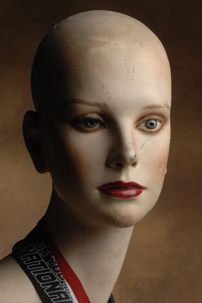
Main Light only - Distance 8'
|
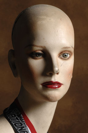
 Main Light only - Distance 4'
|
|
Portrait Lighting for photography
The three pictures above and beside this, illustrate a couple of interesting details… First, take a look and see how the length of the nose shadow is shortened as the light source seems to wrap around the subject as it gets closer. Yes, I had to adjust the light intensity for this illustration, because as the light got closer, it also became brighter.
Second… Notice how the background appears to be darker as the light got to be closer. The reason for this all explained in the “Inverse Square Law”. As the light got closer it became proportionately farther away from the background.
Inverse Square Law
The inverse square law says that the light intensity is inversely proportional to the square of the distance traveled. As distance increases, the intensity decreases.
|

Main Light only - Distance 2'
|
|

Main Light - Distance 2' w/ background light
|

Main Light - Distance 8' w/ background light
Notice how the background doesn't graduate like the other image. That's because the main light was lighting the background too.
|
|
Needed Power in portrait lighting– Back in the old days… (God, I hate that I’m saying that…) Photographers couldn’t seem to get enough power out of their flash equipment, ,now in the age of digital photography, it seems that we can’t get little enough power out our flash equipment. The Senior Portrait photographer friend that I mentioned earlier, has this problem. Because of his limited working area, he has a very difficult time getting little enough power of his flash equipment to allow him the limited focus that he wants. If he had a little more distance to work with, he could move the flash head back far enough to so that the fall of off would produce the desired aperture. So, if you need a little shallower depth of field, and your flash is already turned down as far as it will go, you can always move the flash head farther away from the subject, that is unless the light stand is already up against the water heater…
Subject Movement in Portrait lighting – I’m not talking about camera movement or a blur that you might get if the subject moves, but the variation in exposure you will get when the subject moves. I’ve seen this happen, especially when you’re shooting models that are standing up. If they’re standing, instead of sitting, they tend to rock around and switch weight from foot to foot and just plain fidget. If your light source is very close to the subject, the distance change from when the model has his weight on his right foot instead of the left foot (where you test the lighting from), could prove to be very significant. You know that the closer you are to a light source, the brighter it is. What you may not realize is that the relative effect is amplified the closer you are to the light source. If the light is six feet away, a little rock is no big deal, but if the light is a foot away, it is a big deal.
Unintended Consequences in portrait photography – There’s something that most photographers don’t really consider and it tends to make a pretty big difference in their portrait photography. Most portrait photographers use more than one light in their setups. Usually there’s a main light, and a fill light, and sometimes a hair light, and sometimes even a background light. What most photographers don’t take into consideration is that often times one light often affects or contaminates what another light is doing. The main light is illuminating the subject, like the photographer wants it to, but what the photographer doesn’t know is that the main light is also lighting the background. Sometimes, it’s not big deal, other times it is. As you become more and more experienced as a photographer, you will want to totally control the situation you’re photographing. There may be times when you really want to keep the background dark. On way to do that would be to keep the main light very close to the subject. so that the relative distance from the main light to the subject is such that the light “falls off” more when it hits the background, therefore keeping it darker.
Like they say… Size does really matter, but so does distance.
Tell that to the guys at the bar and take a look on their faces. :+)
|
|
|
|
|
|
|
|
|
Michael Ray's photography and advertising links
|
|
|
|
|
|
|
|
|
|
|
|
|
|
|
|
|
|
|
|
|
|
|
|
|
|
|