Studio Tabletop Lighting - The details...Studio tabletop lighting is a subject that many professional photographers don’t care to share much information about. Each professional photographer has his own little secret techniques for achieving his lighting effects. In the article below, you will see how a professional tabletop photographer lights his shots by looking at the backgrounds after the tabletop set is striped of its subjects. |
|||
|
|
I always try to keep an eye out for something that I think novice photographers would find interesting about the world of professional photography. So here is one of those things: Studio tabletop lighting samples. It’s not a really big thing, but if you’re interested in studio table top lighting, food photography, or just photography lighting in general, I think that you might find viewing these samples here worth your time.
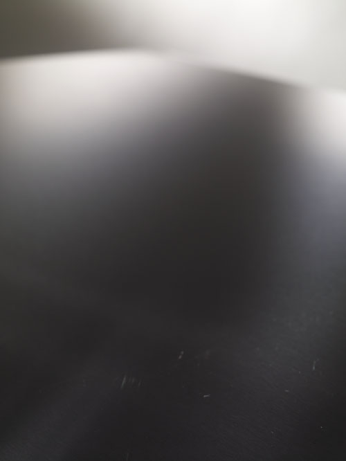
I have a client that I work with from time to time that insists that I photograph the backgrounds after every shot we take. The idea is that if he gets in a jam and doesn’t like something about the photo’s background, a bad shadow, or anything else in the final image, he can go to the background shot and steal from that image to clone in a bit of background that isn’t hindered by shadows or reflections. It’s a really good idea, if I remember to take a shot at the end of each individual shot. I usually need to be reminded… |
||
|
Most novice studio tabletop photographers just think that you “put light” on a photo subject, when in reality, the lighting of a normal professional studio table top shot is quite intricate. We studio photographers sometimes need several light sources and a bunch of other things (mirrors and reflectors) to add light to add and subtract light. So here I was, shooting for this client the last two days and when it came time to burn some images, I realized that the backgrounds were kind of cool and informative too. If you really take a minute and look at them, you can sort of dissect the lighting refinements that I made on each shot. Most of the lighting refinements were either made by mirrors, flags, or PPDs (plastic plant dapples, as I call them). I’ll try to talk a little about each shot so you can see what I did with the lighting details. BTW – If you having a tough time seeing details in the images as I talk about them, feel free to pull them off of the web page and blow them up in Photoshop for a better look. The file is much larger then it appears on this web site. Just don’t use them or sell them or I’ll hunt you down like a dog… :+) |
|||
Studio tabletop lighting sample #1
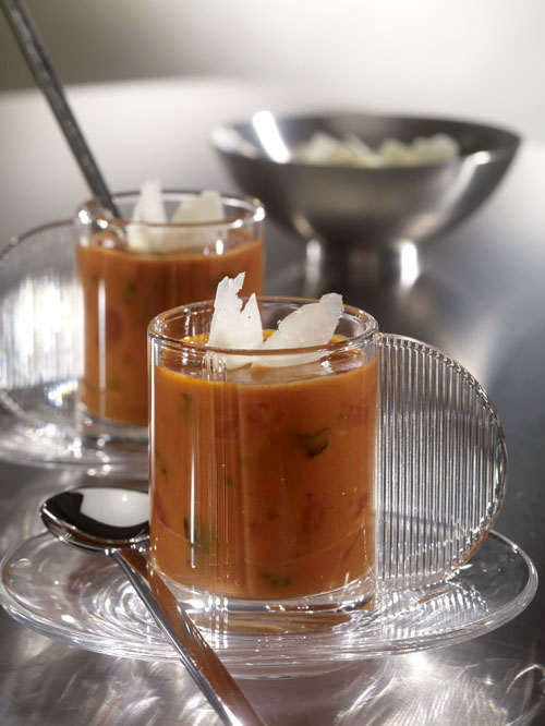
We used a stainless steel tabletop for this shot, which is always challenging. The thing about shooting something this shinny is that you spend lots of time lighting the “thing” reflecting into the surface, as much as you spend time actually lighting the surface itself. The white paper background was lit very carefully so that we had good horizon separation where we wanted. For example… See the highlight on the right side of the horizon? (about 1:00 on the image clock) It was from a light shinning onto the background out of the view of the image area. That highlight was used to separate the bowl from the background. It's sort of like playing pool. The reflection bounces off of the surface just like a pool ball bounces off of the rail of a pool table. If you look closely, you can see streaks of light crisscrossing on the bottom third / middle of the shot. These lights (actually mirrors) were used to give sparkle to the cups holding the soup. Pretty much every highlight you see was evaluated and examined to determine if we (as a team) like it or not. We probably took a hundred pictures in order to finally get to this point. Every highlight is where we wanted it and is as bright as we wanted it. Very little in a professional studio table top shot is there by chance. Actually, it might have happened by chance, but it ended up staying by decision. No, those aren’t toenails in the soup… |
|||
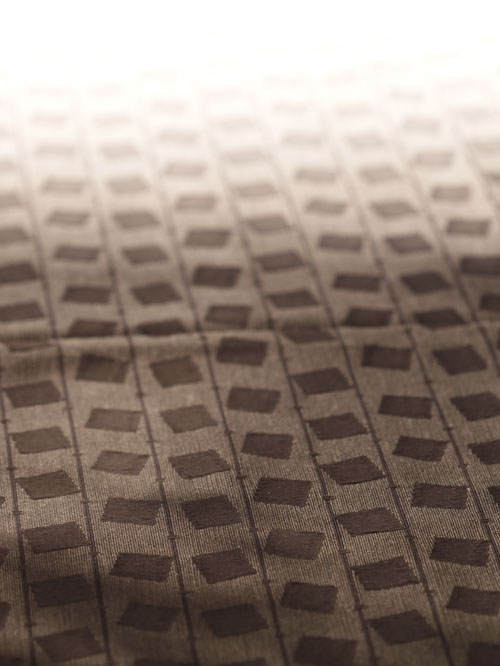
Studio tabletop lighting sample #2
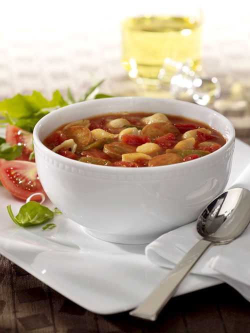
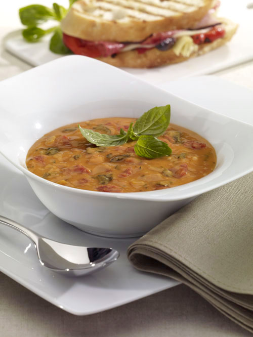
On this shot, you can’t really see a lot about the light manipulation except for a couple things… If you look at the actual shot you can see how the napkin has a shadow graduation toward the corner of the picture. This was done to divert attention away from the corner of the picture and toward the soup. (the stuff we’re trying to sell) You can also see how we “blew out” (graduate to white) the background at the very top of the image. This added some interest by creating a little change that kept the shot from being too boring. |
|||
|
|
|||
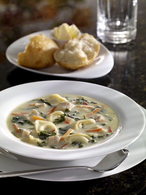
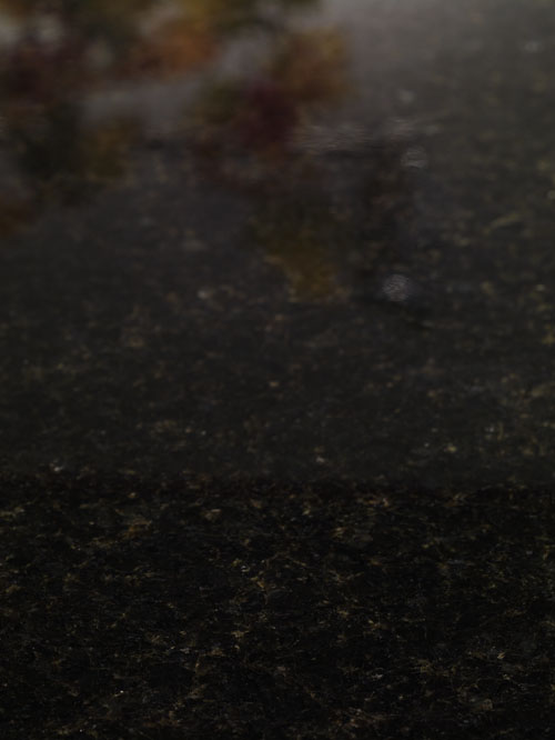
Studio tabletop lighting sample #3
This shot was made on a black marble background. (which weighed a freakin ton!) We wanted to utilize the reflectance of the marble in the shot somehow. Earlier in the shoot, I tried to use my PPDs to add some shadows to the background, actually, the reflections in the background. I set up a white paper seamless so that I could shine a light in it to cause the light “glow” you see in the background shot. The PPDs that I usually use are green in color, but the marble was so shinny that the green color was very evident, and not that appealing. We didn’t really like the green color, so I went back into the prop storage room and come out with some fall colored ivy that I ended up draping over a c-stand arm. You can see the arm in the reflection of the background image. Luckily for me, the plate covered up the reflection in the "real" shot. Notice the streaky light on the front plate… We ended up placing a clear, non colored, stained glass between the main light and the subject to get that effect. |
|||
Studio tabletop lighting sample #4
On this final shot you can see how we blew out the background again. What I think is interesting on this shot is the way you can see how I added extra light (with a mirror) to the left side of the shot in order to lighten up the salad. You can also see how I used my PPDs again to darken the front corner of the white plate. Also, notice how you can get lazy and not iron the background mateial if you know the plate is going to cover the wrinkle… Hey, time is money. :+) So there you have it, insight into the world of studio tabletop photography lighting, through the clues left by a hungry photographer and an Art Director that likes to cover his tush by having a semi-clean background to clone from if the need should arrive. |
|||
|
© Michael Ray 2008 |
|||

